Signs in Limbo
"Signs in Limbo" is a series of photo-based works created in digital format. Steeped in a vernacular sensibility, the collection finds its concept placeholder in an object endemic to any commercial district.
Commonly referred to as an "on-premise" sign and usually appended to a building's architecture, this structure has the essential function of identifying a place of business.
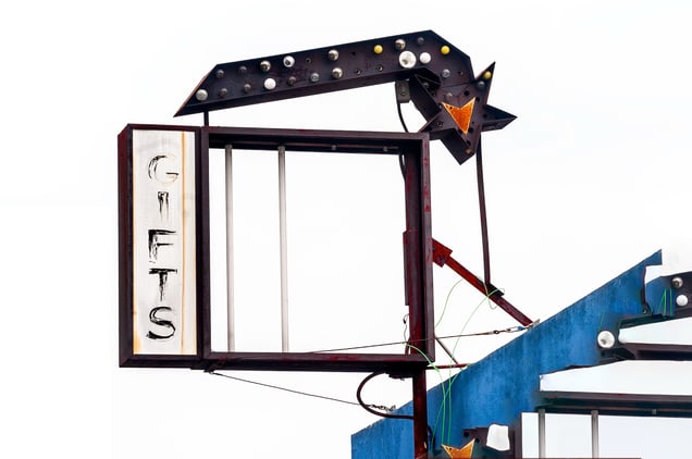
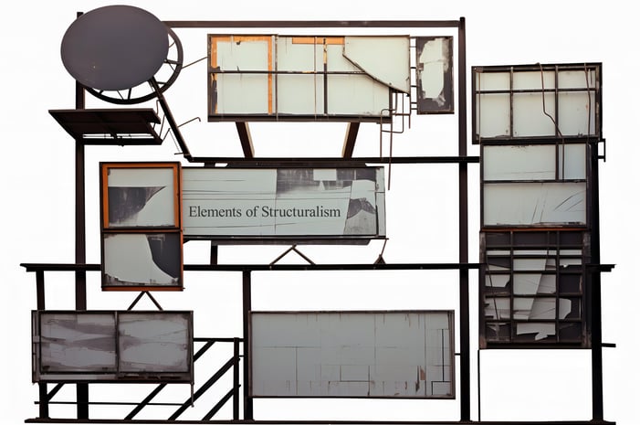
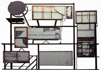
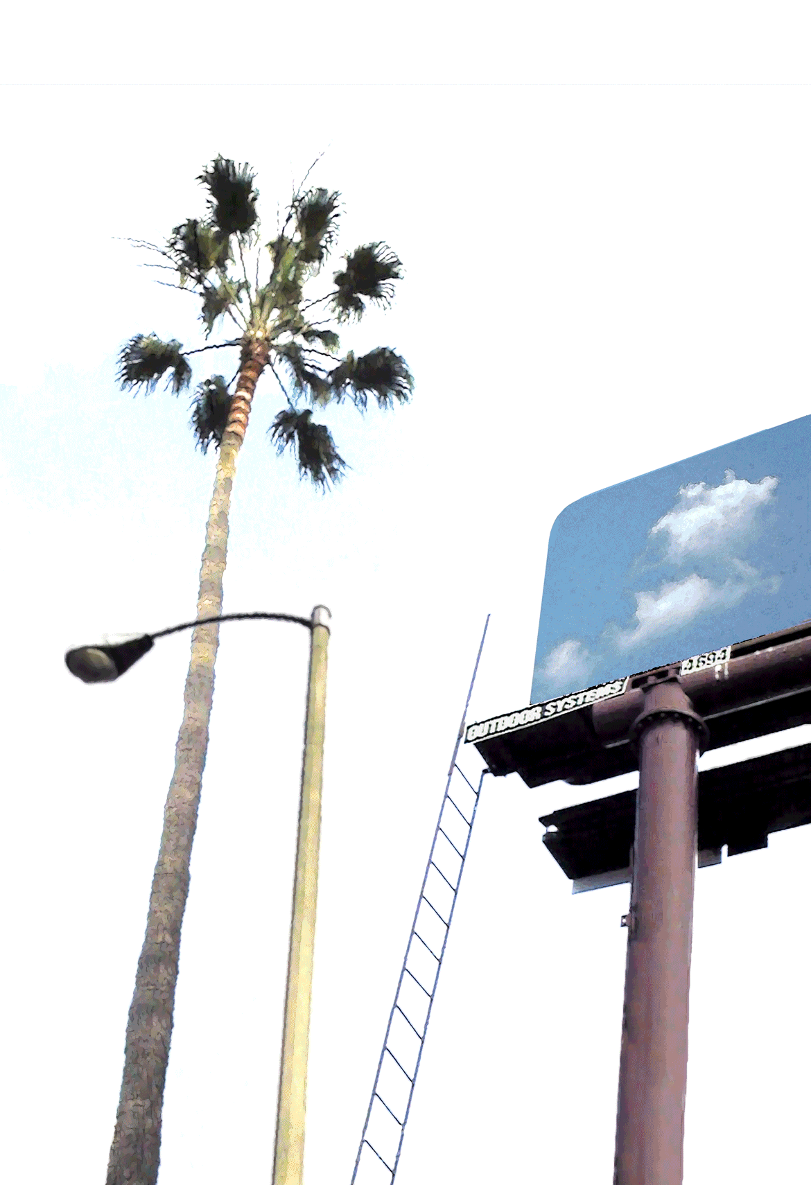
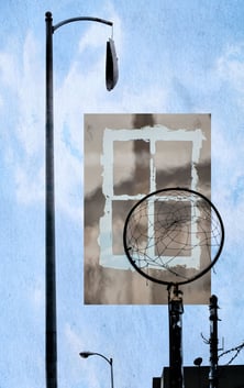
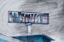
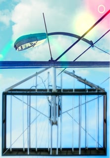
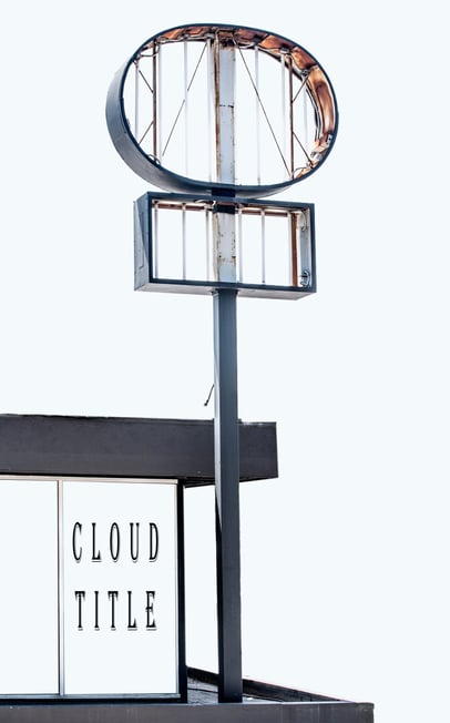
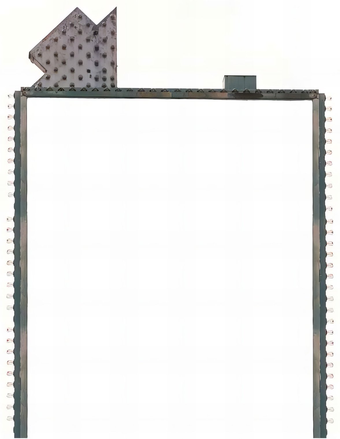
As retailers relocate or companies liquidate, they pull down their signs, leaving behind the empty sign holder. Each piece in the series showcases such an abandoned and gutted apparatus, spotted by the artist who makes it the subject of a dedicated photoshoot and subsequent study.
The empty sign holder, divested of its message and thus lacking purpose, alerts us to a crisis in language and its capacity for communication. Abandoned by the stewards of commerce, the forsaken object persists as an empty shell which, in a strange reversal, is freed from the burden of signification and can only fall back on itself. It is in this permutation that it becomes the protagonist of a singular event.


Click on image for full screen preview


The best way to kick start your business
The Signosphere envelops our world. With 700 new commercial products being introduced every year and 2 million brands vying for attention, the average American encounters 3000 ads a day. Children are exposed to 400,000 commercials a year. They can recognize logos at 18 months and will assimilate 300 to 400 brands by the age of ten. It is obvious that the abundance of signs surrounding us influences the way we perceive the world. Yet as a result of inurement or simply because we are born and raised amongst them, we seem impervious to their relentless assault. Advertising messages can inform the way we speak and relate to each other. They influence our decisions from the supermarket shelf to the voting booth. As tools of communication but also instruments of persuasion, one cannot imagine modern life without them. In a future and perhaps healthier age, a comprehensive analysis of their impact on the human psyche would make a good chapter in a historical study of the deficiencies of late capitalism.
The onslaught of signs in commercial districts often exceeds the goods or services they are meant to advertise. Whether indexical or informative, representing a manufactured product or a business to business corporation, they are conceived and built to impart maximum impact. Their challenge is to stay ahead of not only the competition but ultimately, the jaded eyes of consumers. To state the obvious, signs are first and foremost a visual phenomenon. They betray the predominance of the faculty of sight in our species, the privilege that showmanship holds in our minds. The optical burlesque of Times Square New York is wasted on the visually impaired and for good reason, no one entertains the idea of a Las Vegas for the blind. Retinal activity as a physiological function is often subordinated to a more encompassing albeit abstract notion of vision. Even blindness extends a phantom limb at the service of a visually biased cognition that speaks for all the other senses. In a society so dependent on optical determinations and so enthralled by spectacles, the sheer amount of visual stimulus hardens into a rigid front, a frozen dam hindering the flow of information a living environment needs to breathe.
Because they represent multifarious products, the signs lining city streets do not seem related to each other. Their dissonant coexistence precludes the reassurance of a linear narrative. However, the imbrication of their disparate messages weaves a language that permeates the environment. Signs are the communication medium of the street. Their pervasive language is molded by the ebbs and flows of commerce. Their grammar tallies with the gambles of risky business ventures. Their jargon keeps step with the fugacious blossoms of a market’s changing trends. Not exactly the measure of a nation’s literacy, street signs nevertheless embody the perfect collusion of word and image. The word no longer sanctioning the idolatry of graven images, the sign as taboo buster surrenders to the graphic housing that contains it. It is the celebration of the word become image in commerce’s eternal return of the repressed. It blinks as a fleeting syllable in an environmental language that does not command our full attention and yet, astutely fills our perceptual field with its ambient rhetoric.
As a landscape phenomenon, signs come to the aid of urban architecture by adding design flexibility to its often-deadening homogeneity. They accessorize the livid fascias of countless establishments and with fashion-conscious aplomb, dress up the drab standardization of city blocks. However, aside from the aesthetic enhancements they bestow and considered in their inexhaustible entirety, they amount to much more than a decorative layer that merely covers the structure of buildings. Signs spring up from these very structures, becoming an integral part of urban design. They form the syntax of a language not just tattooed on the surface but growing from a city’s innermost parts. Heralding the architecture of the future, they subordinate space and access to a labyrinth of directives. From this signcentric maze, they retrofit anonymous facades with themed face-lifts and draw out the cookie-cut designs of franchised signature buildings. They make monuments of their own as in the tall freestanding signs seen off highways. They shape a city’s skyline with the extravagant contours of their spectacular displays.
If an architecture that embodies highfalutin concepts can be intimidating, the signs that abound in urban streetscapes are decidedly not. No matter how dwarfing their scale or elaborate their design, they manage to engage people of all walks of life. In fact, the more oversized and vulgar, the more accessible and welcoming, the bigger and taller, the more visually stimulating and consumer-friendly the retail environment. The gaudiness and pomp of their brightly colored shapes coax the passerby with the warm and fuzzy euphoria of indolent bliss. The baroque exuberance of their designs provides relief from the insistence of needs and the tyranny of wants. Arousal machines simulating picture-perfect lifestyles, they mitigate the alienation that is the price of a hard-earned individuality by eliciting desires easy enough to fulfill with ready-made solutions and promises of stocked availability. For the pleasures they bestow cool the dark and burning urges that torment a psyche given to restless yearnings. The distractions they dish out abate with surrogate delights the restrictive compromises that afflict interpersonal relationships. Solicitous confidants to the heartbroken and lonely, they lift the embargoes of unrequited love, flooding the market with the emancipated products that were once the dirty little secrets of a guilty conscience. With increased personalization, their aim is to give shoppers enough variety as to make them forget what they were looking for, bathing them in the lenitive buoyancy of a collective amnesia. Immersed in this euphoric placenta, consumers feel greatly desired and reciprocate the favor by parading all-over personas that keep them forever turned on.
Signs are the embodiment of our desires materialized in public environments, the manifestation of the fulfillment we strive for. Needs are recognized as the motivators of human behavior and their manipulation, if not outright concoction, is good for business. Lack conditions desire that is then harnessed into a pyramidal “hierarchy of needs” (Maslow, 1954). This motivational structure leads us through five ascending levels. At the bottom lies the attendance to bodily functions and the fulfillment of basic necessities such as food, clothing and shelter. The second stage is concerned with the demand for security and freedom from fear. The third stage progresses into a desire to love and be loved, trumped in the fourth by a call for mutual respect and the need for self-esteem. Finally, as physical needs are increasingly satiated leaving room for the loftier concerns of the mind, we reach self-actualization as the maximum potential of one’s development. These levels are thought to be hierarchical in the sense that higher order needs can only be achieved if lower ones are satisfied. Given this extractive ranking, It is in the interest of mainstream signage to perpetually stimulate the lower order needs, which as expected, tend to monopolize an individual’s conscious thoughts and actions. Subsequently, by flavoring these lower end needs with higher level ones, the advertising industry finds an ideal way to mobilize its base, arousing it with a constant flux of excitement, pumping it up only to reduce it to its lowest, most common denominator. The signs themselves sit at the top of the pyramid, self-actualized and towering above an audience kept in a state of arrested development. From the heights of their power structure, they descend like beacons of democracy to nurse the cravings of a captive and infantilized public.
Habituation is the entropy of signs. The threshold that engulfs them in the humdrum of the commonplace. Thus to maintain a sustained level of interest and consensus permitting, they flaunt their decorated messages as an escape from the indifference of the ordinary. Miracles of a consumerist horticulture, their flowerings of plastic, neon and steel picket the monotony of wall to wall pavements. Their ornate shapes, replete with giddy declarations, compete to keep a head above the effacing haze of the familiar. Visual magnets swollen with promises of emancipation, they vie for the satiation of our appetites and wed every whim to the instant gratification of its commercial availability. Lighthouses of deceit or totem poles of retail bliss, they usher our desires to their intimate destinations. They constitute the urban flora and yet, unlike ordinary flowers, these attractive displays are not at the service of their cross-pollination but prevail as obdurate and terminal flytraps.
Signs can be ambitious but not ambiguous. As business promoters they must refer to the product they represent as straightforwardly as possible. Granted that the advertising industry’s use of reverse psychology can result in messages that dispatch a desired effect through indirect means, the fact remains that the end result is more than ever the unwavering promotion of a particular product. In a more playful way, a sign can utilize a text or graphic element that is completely unrelated to the product at hand, yet again, this method relays a coded message to the cognoscenti who feels all the more privileged about the imminent sale. Another fact is that directness notwithstanding, a sign’s reference is necessarily external to it. As signifiers, they invariably carry their signifieds to another object, person or idea. Any self-reference would simply short-circuit their utilitarian function. Therefore as speech, the freedom of which is promulgated by the first amendment of the U.S. Constitution, commercial signs are quite verbose but in order to perform any of their multiple functions, they can never really talk about themselves.
To disclose its existence in a physical environment, a business props up a sign on its premises. To get integrated in the supporting context of the marketplace, commercial entities design their signs for customers to recognize them, identify with them and once hooked, keep them coming back for more. On-premise signs are essentially identity tags. Their massive labels, odes to the triumph of the ostentatious, welcome newcomers to the temples of consumerism. They help a business put its foot forward in the world. They entrench the reputation of a product by encouraging brand awareness in the malleable psyche of the shopper. Yet as accomplished as that identity can be, it has to be evaluated frequently to remain relevant and conform to its changing market. Visibility securing an address on the commercial map, the frequency of a sign is what ultimately determines its effectiveness. The long enough repetition of a message consecrates it as the unadulterated truth by creating the memory of it always having been so. Advertise or perish becomes the motto of corporations eager to corroborate their identities across the surface of the globe. Through brand awareness they succeed in strengthening the bonds that bind businesses to their customers, arousing the public’s emotions to the drumbeat of dramatic profit increases. In a world where the advertised image becomes a reflection of the true inner self, and as our modern identities begin to exfoliate like the packaging of marketed brands, corporate insignias ask us to identify with them to such an extent that they begin to blur the distinction between us and them.
There is no better way to give free reign to the beliefs that actuate our actions than to corroborate them with universally accredited observable facts. Thus the advertising industry is hard-pressed to legitimize its modus operandi with the endorsement of favorable cultural and scientific studies. For instance, they want us to believe that competition is the dynamic force behind progress, that rivalry brings out the best in us no matter what casualties are left behind. They want us to strive for fame and fortune because what else would we be competing for, because it is human nature and has always been so, because opinions notwithstanding, it is clearly observable in nature. Truth follows intent and after all, we are not very surprised to find biological evidence that sustains our society’s extreme cult of the personality. We all yearn for the admiration and adulation of an obsequious public even if we do not freely admit it to ourselves, even if it lays dormant behind the deconstructive impetus of critical thought. Society is an arena of competing personas. Advertisers are identity brokers. With enough exposure an identity gets canonized as an icon to be revered and emulated. A prominent business sign today. A superstar tomorrow. A beauty pageant in the ghost town that is the end logic of capitalist competition.
the fine print

Explore the artworks
of Ely Tahan on social media:
CONTACT
© 2025. All rights reserved.